Microsoft Surface Hub
Final product designs
Overview
How do you design an interface for an 84" touchscreen? Very carefully...
I worked on the Surface Hub project from conception to release as both a UX and visual designer. My responsibilities included mainly the built in Skype for Business application but I had much to do in the thinking of the overall operating system UX as well.
The Hub proved to be a difficult nut to crack. 84" seems like a huge size but when you are designing for both a 1ft experience and a 10ft you are hit with a number of issues. Text sizes look too small at a distance or too large up close. Finding that balance of which info needs to be seen/interacted with at the 10ft level and what needs to be used when directly manipulating the screen is the only way to make it work.
Physicality of the user comes into play as well. Controls too low and tall folks will be pained to reach them. Controls to high though and short individuals cannot reach them at all. This research pointed many controls into non traditional directions that when looked at in a screen shot don't necesarily make sense.
Even things like dragging window become difficult when you are literally dragging that window 4ft to the right. I loved working on this project because it challenged everything I thought I knew about interface design and pushed me to think outside the box at every turn.
Research and Ideation
Much of the Surface Hub experience and thinking was born from an envisioning project somewhat jokingly dubbed "Wall-E". I worked closely with other designers across Microsoft to provide an idealized experience using current and future technologies. This project brought hardware and software experiences together to provide a holistic view into the future of corporate meeting rooms.
While a multitude of ideas came from this project the ones that stuck with me the most where the ideas that the physical space fundamentally defines the experience and not only the individual user but the group of users as a whole must be thought of at every step of the way. Another key concept was that both the operating system and communications application must be closely integrated to achieve a great overall user experience. For the next year myself and two other designers combined forces with the Windows design group to take the Surface Hub from nothing more than a touch screen to a full fledged collaboration and meeting showpiece.

Outline of the different spaces that define the use cases.
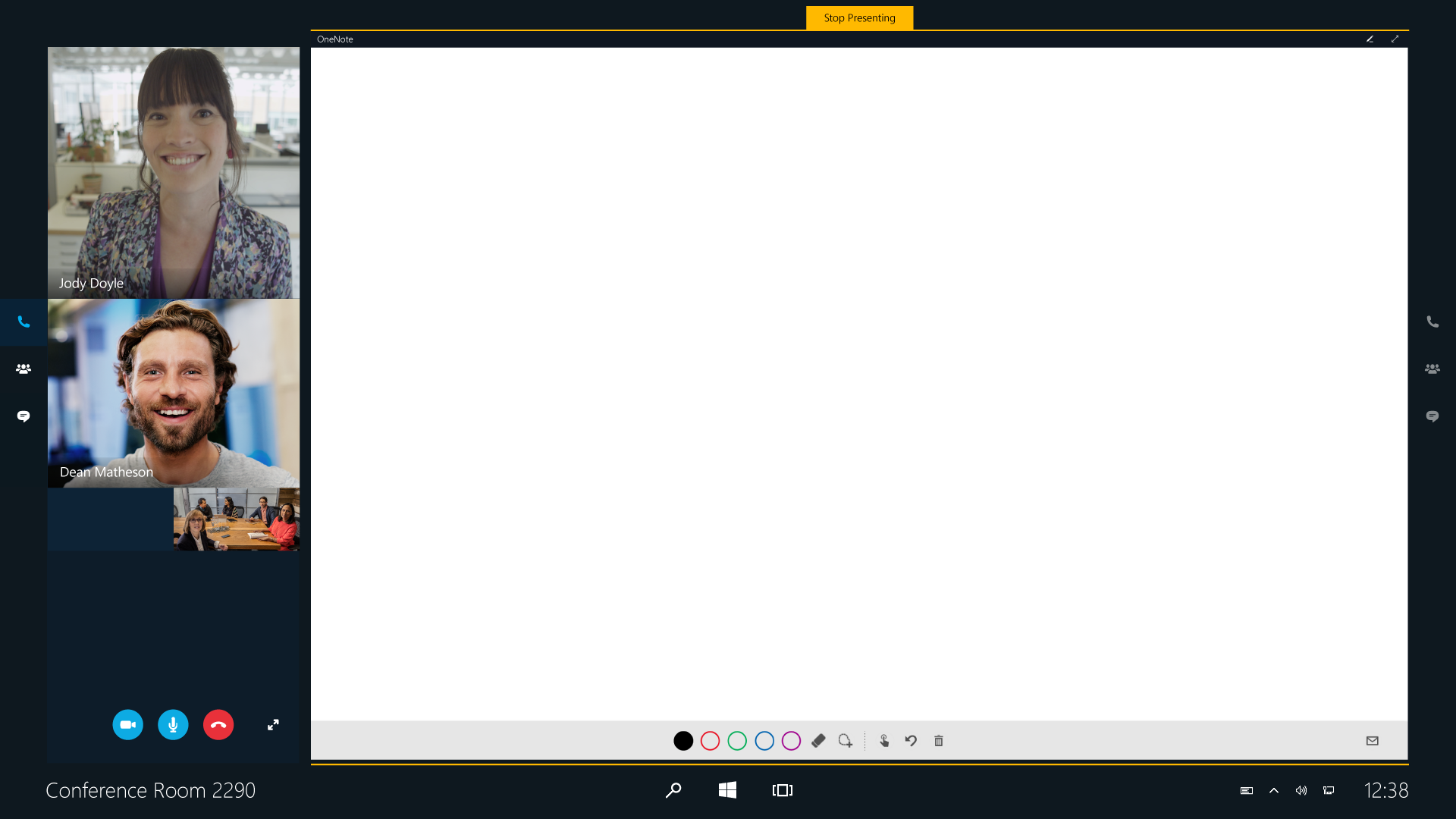
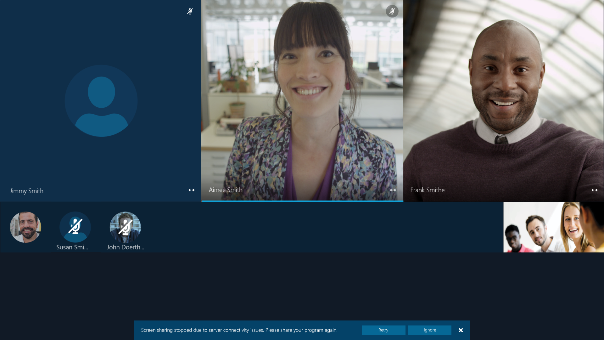
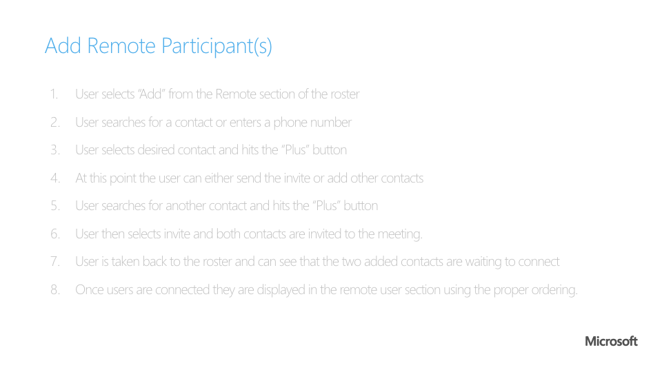
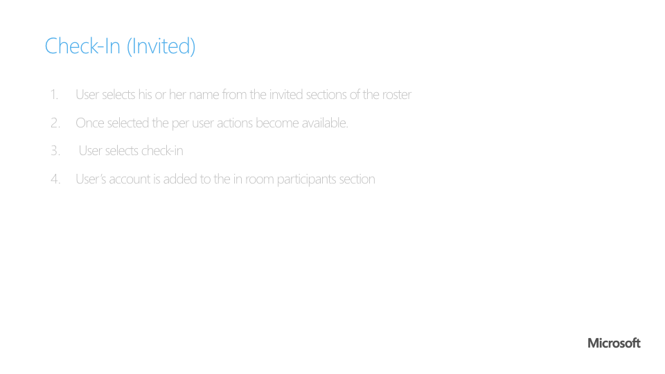
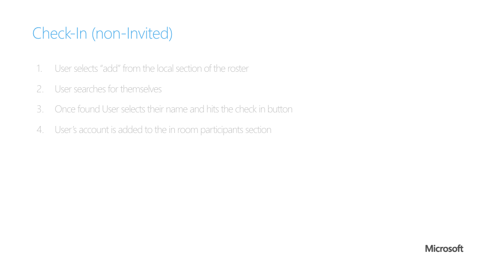
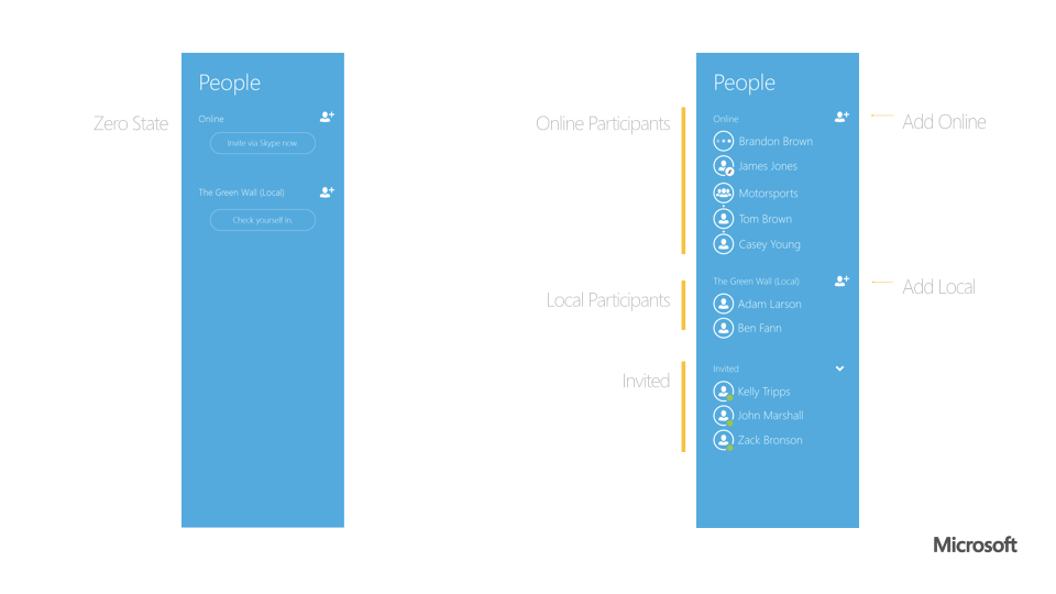
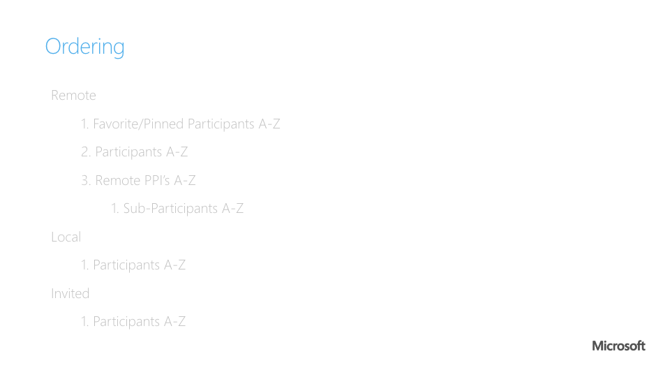
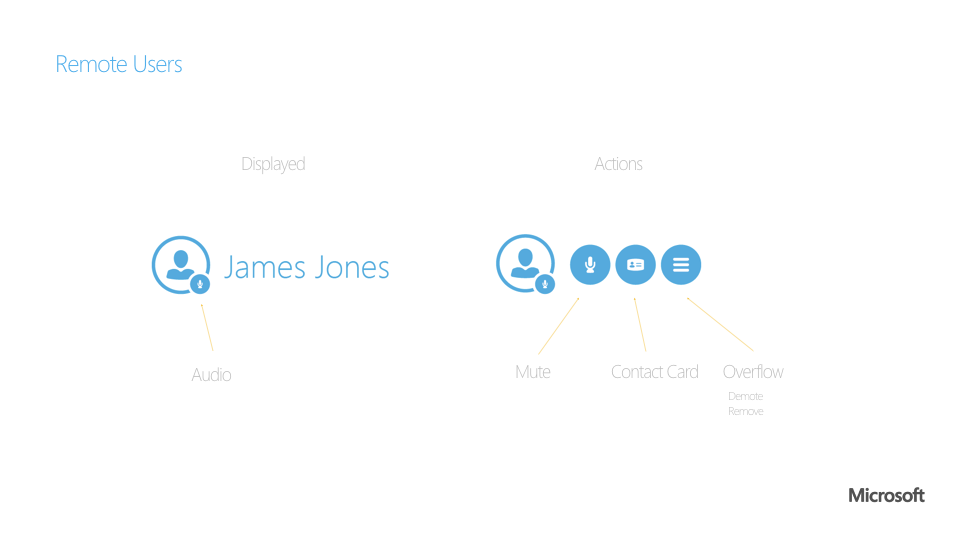
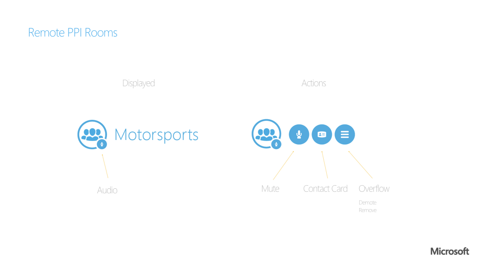
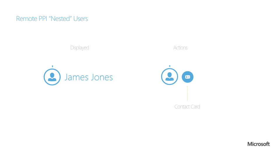
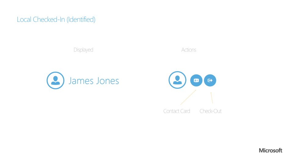
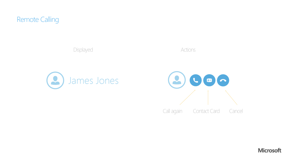
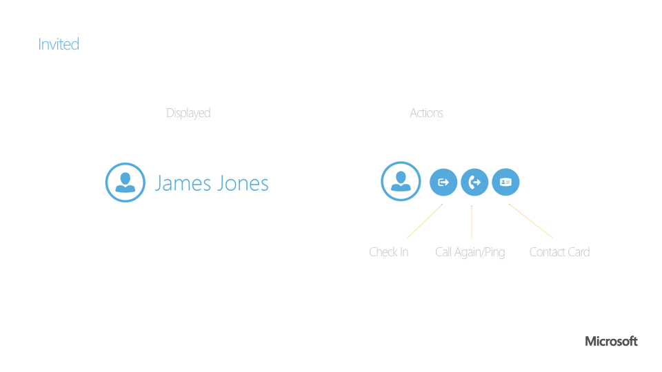
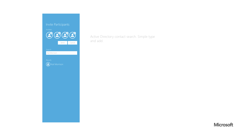
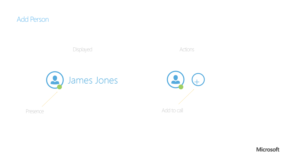
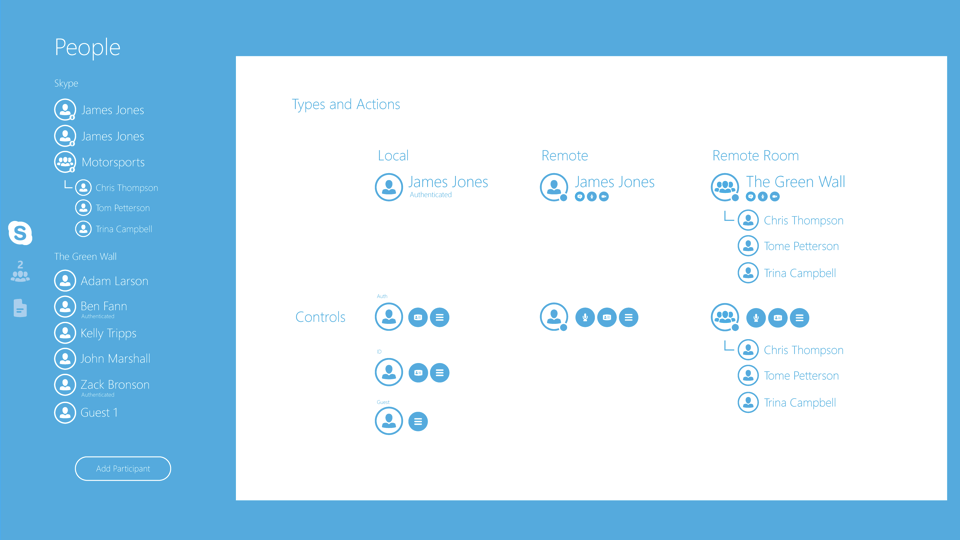
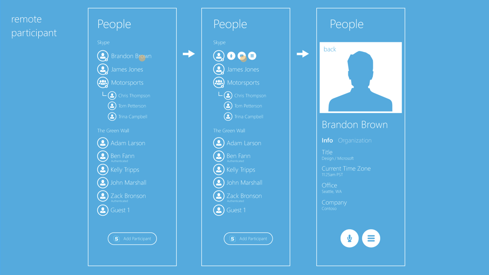
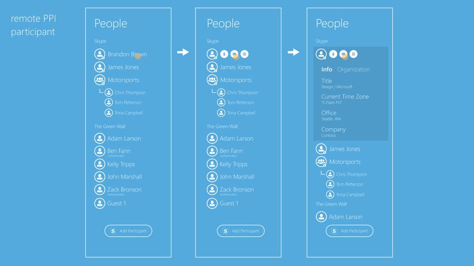
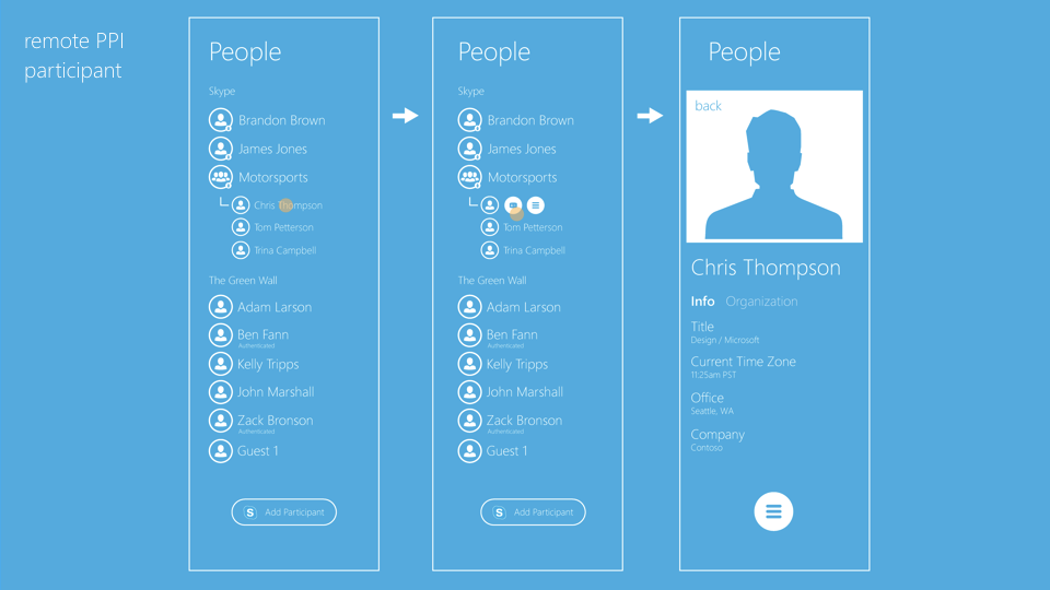
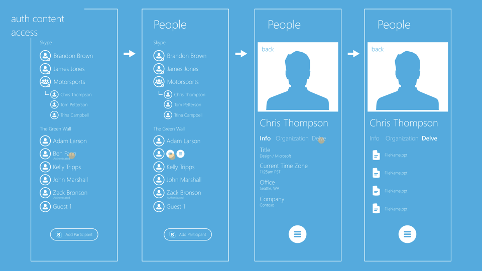
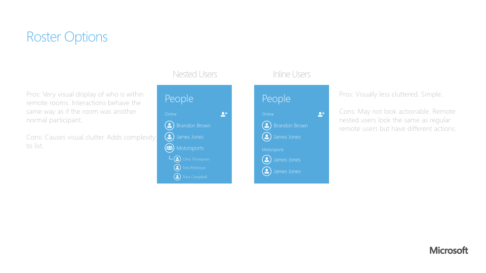
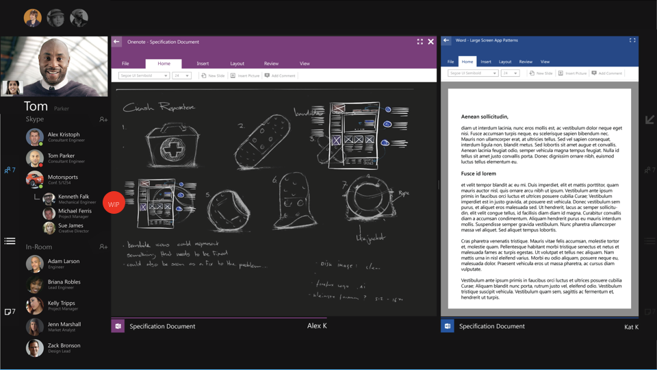
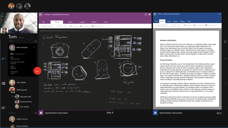
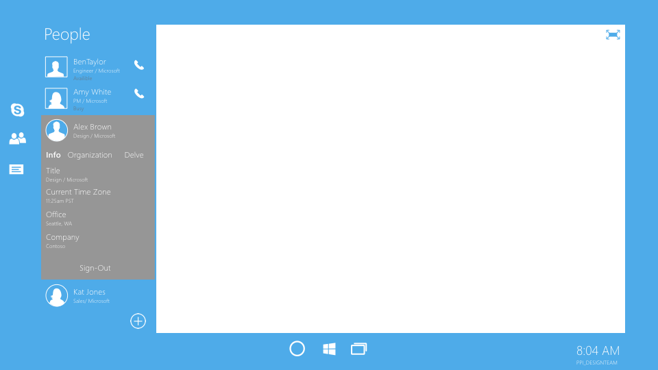
The people roster
Below is a deck outlining the UX and hierarchy of the meeting roster. I worked to simplify interactions, provide a more robust categorizing system appropriate for a conference room scenario and design in a way to worked for a large screen experience.
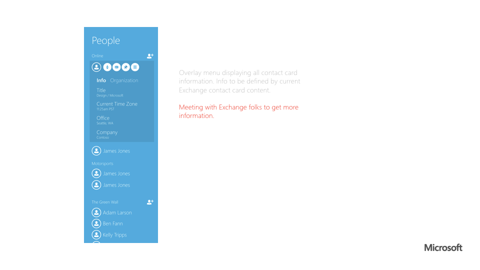


More info:
Lync/Skype for Business at the time had what I deemed to be too many features associated with it's roster controls to be ported over to large screen. I distilled down to the bare minimum what controls that a user would actually want in a conference room. Keeping in things like adding another remote participant, muting the audience and removing someone from the meeting while removing the rarely used and confusing promote demote, full contact card and connected modalities.
I also introduced a new concept in the Skype for Business world specifically for meeting room devices. The Check-In. Users in the room traditionally are represented as the room, usually with a terrible name like "Conference Room 2290," this type of name give no context, no identity and no help for the remote user to know who is physically in the room. By allowing users to identify themselves as "in the room" they are able to take part physically in the room and digitally in the online meeting. The not yet joined section of the list is the counterpart to this process, allowing for users to not only know who hasn't joined yet but also a quick way for users to check themselves in with a quick button press.
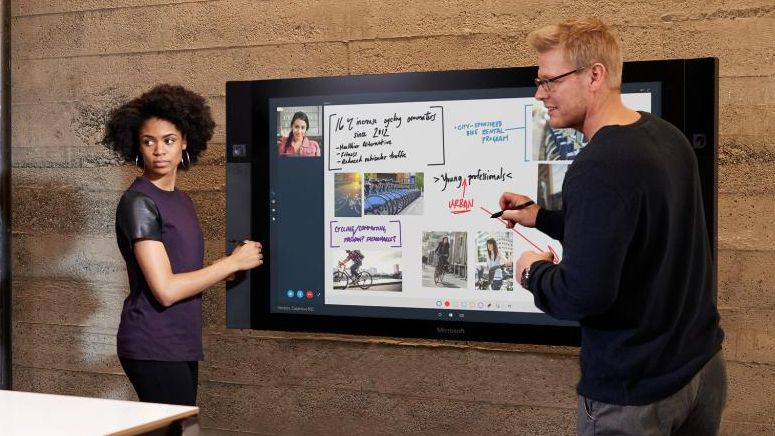
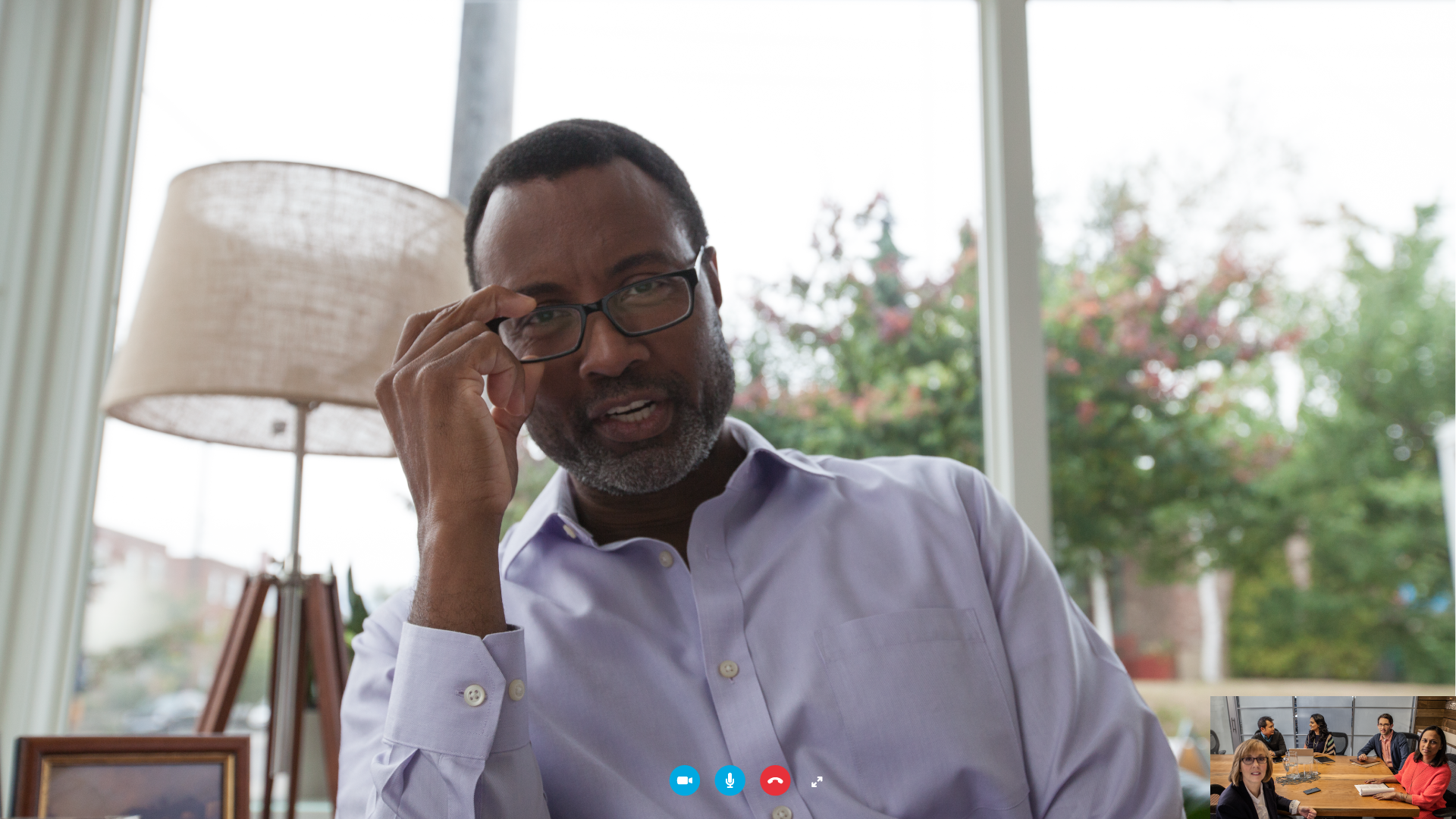
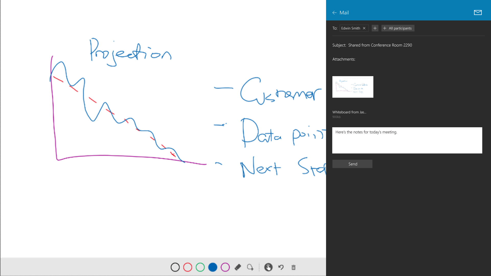
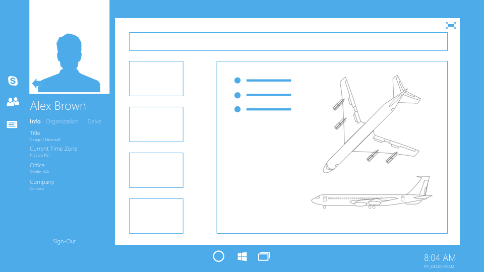
Camera and video positioning
Eye contact while working with a remote participant is key to a good experience. The specially placed cameras work in conjunction with how we designed our video layouts to give the best experience for both the in room and remote user. From a standing position the in room user simply looks naturally towards the video when speaking resulting in perceived eye contact. Below take note the camera along the left side of the bezel and the positioning of the video.
